Bird Census Project
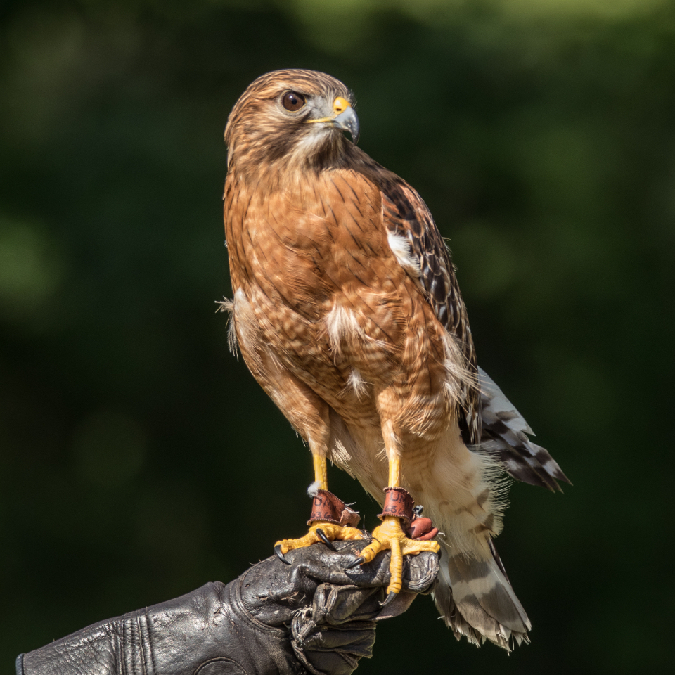
Hawks are interesting to me so I looked at census data from the North American Breeding Bird Survey. I live in the tri-state area of Kentucky, Indiana, and Ohio so I focused on the 342,141 rows of bird data for those states.
Links to follow along:
- My Code for Kentucky Hawks.
- My Code for Tri-state area Hawks.
- Data.gov Bird Data Article.
- North American Breeding Bird Survey Census Data.
- Interactive Bird Species Map.
- Hawk Conservation - Hawkwatch.org
I started with Kentucky and first had to select the three hawk species I wanted to look at. I chose the 3 most common: The Cooper's Hawk, The Red-Shouldered Hawk, and The Red-Tail Hawk. Each had an identifying number that I selected for and made a dataframe for each. I then sorted each hawk's dataframe by year from the beginnning of the survey in 1966 to the final year in 2018. This would be important to loop through the multiple rows for each year. Once the loop was done instead of multiple rows for each year I had only one row per year for each hawk. I then compared the counts per year of each species of hawk.
Kentucky Hawks
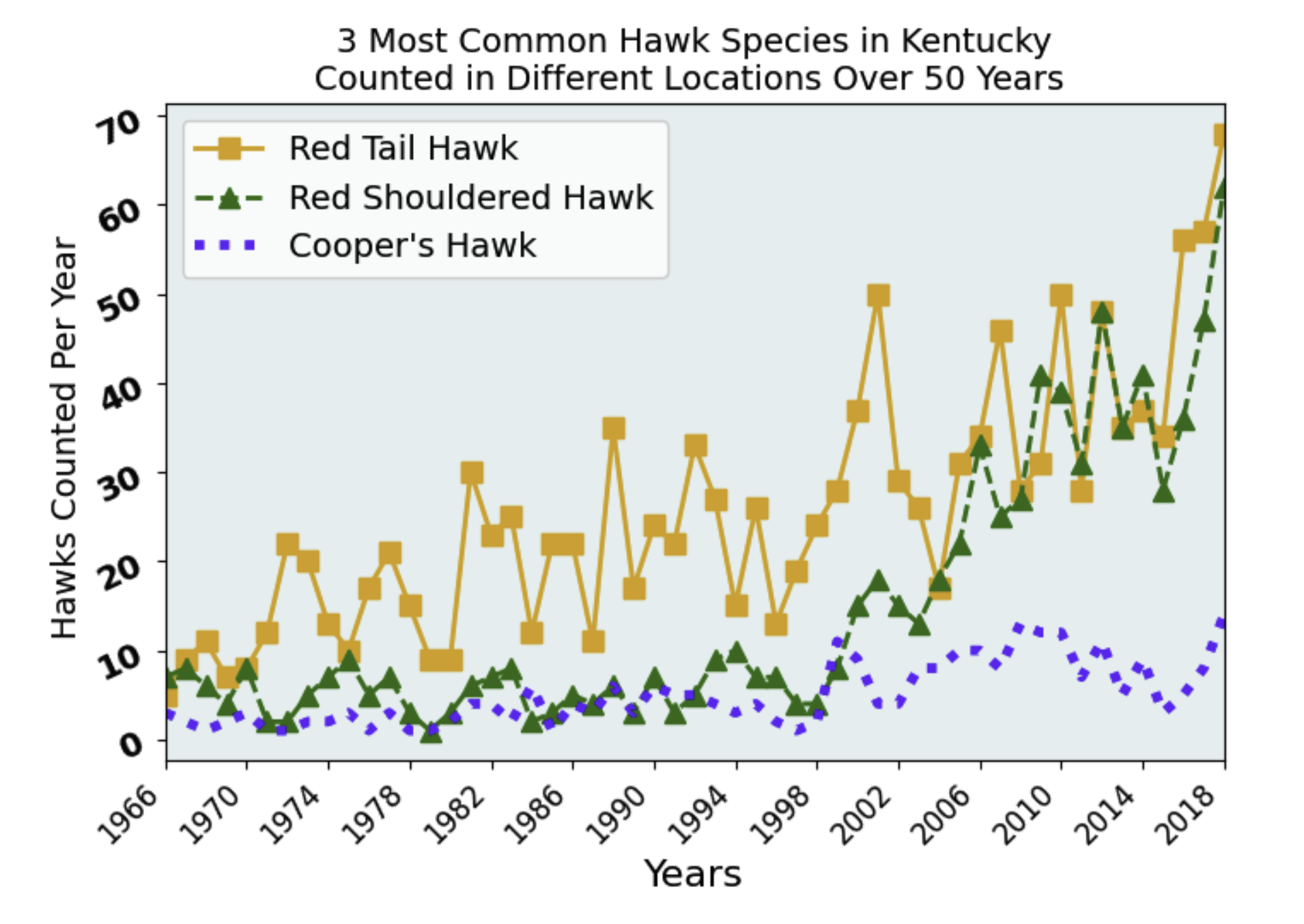
The Kentucky Graph Shows:
- The Red Tailed Hawk (Orange squares) has been the most common in Kentucky.
- The Red Shouldered Hawk (Green triangles) in population has really improved essentially almost matching the Red Tail by 2018.
- These correlate with dips and bounces in their counts. For instance, a bad breeding year for the Red Tail was also correlated with a bad breeding year for the Red Shoulder. This is clearly seen as the Green starts matching the Orange in up and down trends.
- The Cooper's Hawk (Blue dashes) never put up numbers like the other two.
- The low numbers in the early years make me wonder how reliably the bird data was collected or why there are more hawks counted closer to the present. Are these hawks really able to increase their numbers that much? Maybe they are just becoming better adapted to thrive in suburb type environments alongside of people.
Kentucky, Indiana, & Ohio Hawks
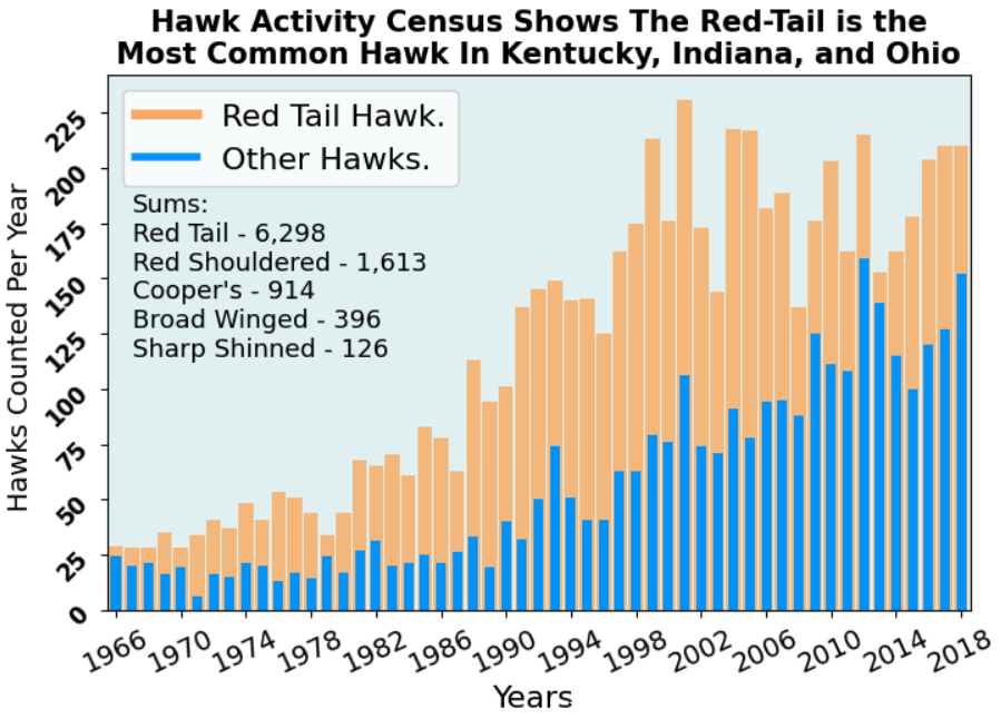
The Three States Graphed Together Shows:
- The Red Tailed Hawk (Orange) is still the most common even when compared to all the other hawks combined (Blue).
- The Red Shouldered Hawk is still the second most common with a total of 1,613 counts over the 52 year study.
- There is still a high correlation with dips and bounces in yearly counts. For instance, all hawks had good breeding years in 1993, 2001, 2012, and 2018.
- Yearly trends seem to indicate population counts have improved and are maintaining good numbers.
- This graph also shows that all other hawks are gaining on the Red Tail whereas they seem to have possibly plateaued. As with the Kentucky graph the Red Shouldered included here with the other hawks could as a whole be challenging the Red Tail for territory.
- The data in all three states together gives a more comprehensive look at each year's recorded hawk counts. With 3x more data it is still appropriately matched and verifies Kentucky's census. In other words Kentucky was a good predictor of a larger sample.
Comparing the Above Graphs:
- My favorite graph was the line graph. The lines clearly showed the dips and bounces for the Red Tail and Red Shouldered's trends matched in good and bad breeding years. It makes me wonder what would cause a good year or a bad year? Severity of winter, prey scarcity or abundance?
- The line graph's shapes (squares, triangles, and dashes) really helped seperate the hawks for a better visualization.
- The bars in the Tri-State Graph really showed the correlations of each year clearly i.e. it was more suited to see individual year counts. The line graph was better to see the generalized dips and bounces overall.
- Both graphs gave a different perspective on the same data and both as important. Dare I say a bird's eye view ;)
- Given more time I would like to graph all 5 most common hawks with a line & shape graph.
- I would also like to further research how and where the data was collected. I read how it was collected but were the locations rural or suburban?
- How would these findings help researchers of hawk conservation?
- Tri-State percentages for all the years: 67% Red Tail, 17% Red Shoulder, 10% Cooper's, 4% Broad Wing, and 1% Sharp Shinned are too broad. We know specifics matter what years, census location, and other specific details.
Thoughts
There is a lot of other data in this data set: wind and weather patterns, route numbers coresponding to locations, other birds, and other columns of data that I could spend weeks analyzing. I really enjoyed the small subset of data that I did analyze. Now when I see a hawk in my neighborhood I'll be able to better guess that it's most likely a Red Tail or Red Shouldered Hawk. The other hawks represent a much smaller statistical likelihood. In the future I plan to revisit this project but I had a lot of fun scratching the surface.
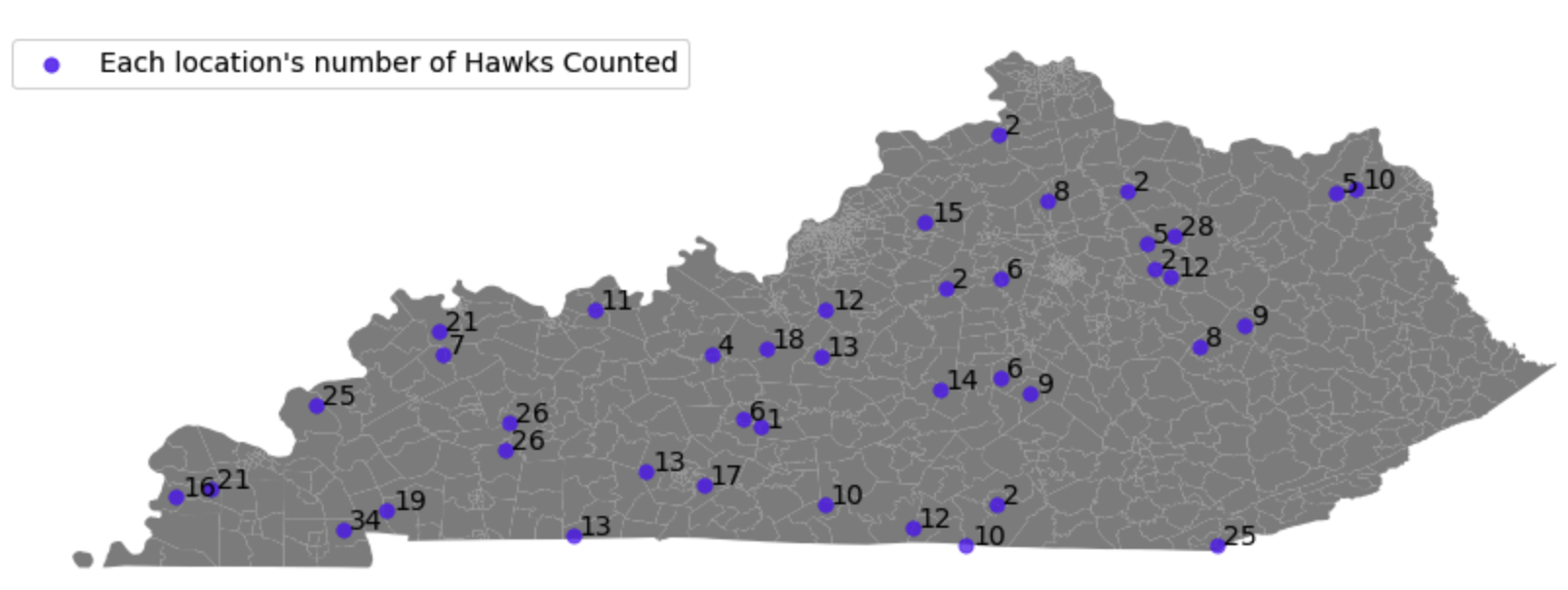
Revisited With GeoPandas
I continued to look at the route locations and decided to give GeoPandas a try for the state of Kentucky's most recent 5 year route counts.
Kentucky 2014 - 2018 Hawk Counts By Location
Route Location Names and ColorMap for Counts
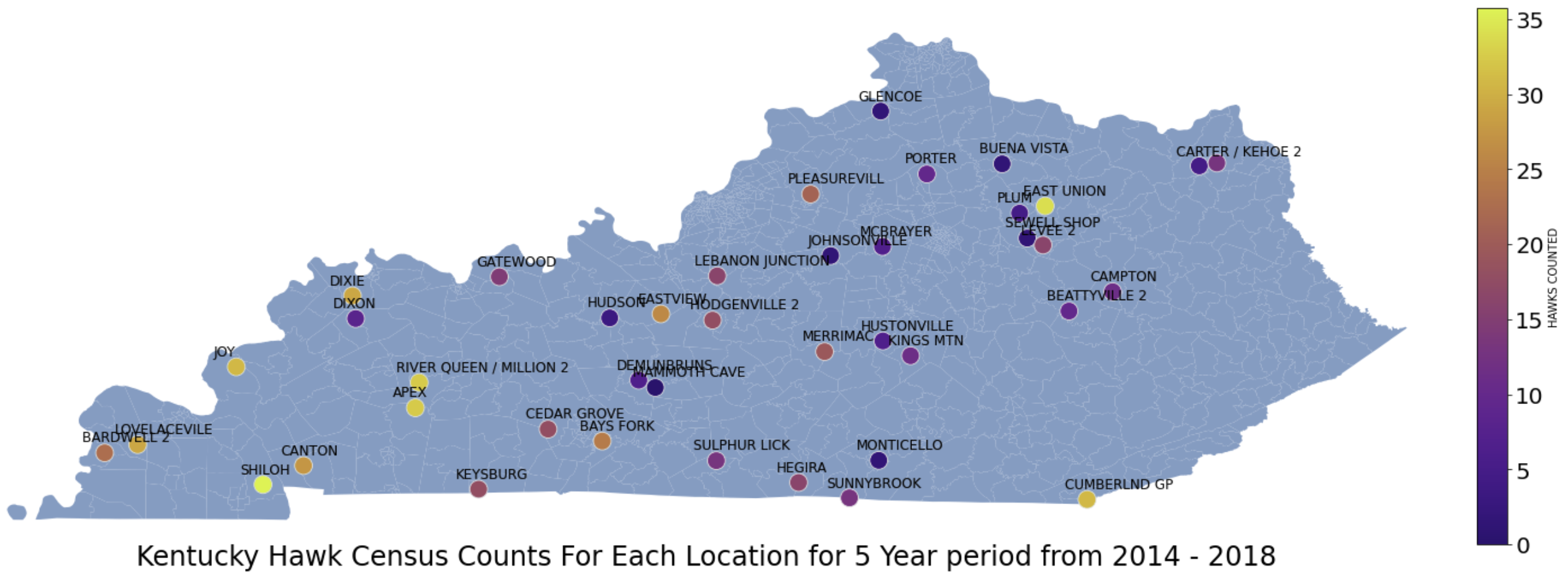
Both GeoPandas Graphs Show:
- My Code For The GeoPandas Map.
- The hawk counts trended higher in the southwestern part of Kentucky. Six out of the eight counts greater than 20 were in the southwestern part of the state. Is there possibly a more reliable food source there? Is that terrain more suited to them thriving?
- The routes "East Union" and "Cumberland GP" in the north and southeastern parts of the state were outliers. They had census counts of 28 hawks and 25 hawks over 5 years.
- Thirteen out of the sixteen route counts less than ten were on the eastern part of the state. Why are there fewer route locations on the far eastern side of the state? Then other areas are clustered with routes such as around "East Union."
- The route with the highest count was "Shiloh" at 34 hawks and the route with the lowest count was "Mammoth Cave" at 1 hawk.
- When two routes' latitudes and longitudes are very close together such as "Mammoth Cave" and "Demunbruns" they can be hard to read because of name overlap.
- The routes "River Queen" and "Million 2" were so close I couldn't tell them apart so I combined their totals into one route location.
- GeoPandas is great but for a larger dataset Plotly and Mapbox might be better suited. Zooming into specific areas for those larger maps would be an advantage. For instance, if a couple routes were very close together you could zoom in to see them and the terrain better.
Revisited With Plotly & Mapbox
I regraphed the above census route locations for hawks in Kentucky using Plotly and Mapbox.
Plotly & Mapbox Graph of Route Counts
The Plotly & Mapbox Graph Shows:
- My Code For The Plotly and Mapbox Graph.
- Now when zooming in you can really get a layout of the census route's terrain. How many trees or how much open space or how populated is it are questions that can be answered.
- The Routes "River Queen" and "Millions 2" are so close they were indistinguishable on the GeoPandas graph. They can now be zoomed in here to see they are indeed seperate just very close.
- Interacting with this kind of graph allows the locations to come alive more.
- There's a lot to learn about graphing with Plotly and Mapbox, but they're truly awesome formats for displaying data.
Conclusion
After plotting yearly counts for Kentucky's 3 most common hawks, the Tri-State's yearly counts, and finally Kentucky's recent 5 year route counts I'm ready to call this look at the BBS census data complete. For a seperate future project I definitely want to continue looking at the data. I would like to plot route counts for the whole US or choose a different bird species. To make it easier I will definitely have to write some functions to better sort through each state's dataframe and compare it to the route location dataframe. For now as it stands, I'm happy calling this portion of the Breeding Bird Survey complete. In conclusion, I'm humbled by how much data is here and was enamored with the data of Kentucky that I focused on. My hats off to the North American Breeding Bird census volunteers and conservationists.